mobile · May 25, 2021
How It’s Made: A Flutter-Based Mobile Timeline
The First Sneak Peek of Quire Mobile Timeline Structure
Back in 2018, we created our first-time ever Flutter app and it was such a blast! Three years later, our Quire app has grown into a more comprehensive app, which went beyond traditional expectations for a mobile project management software app. The current version of Quire mobile app supports all of the views from desktop, Tree View, Board View, and now Timeline view.
When we decided to support the Timeline view on the mobile app, we knew it was no easy task. There were no similar ready-to-use components out there. However, what surprised us the most was that we could not even find any discussions on the internet related to building such a structured view. So, we took a leap of faith and decided to build it on our own.
Here are a couple of things that you should know about what we expected to present in the Timeline for Quire Mobile app:
- Infinite date scrolling in horizontal direction.
- Render On Demand (ROD) - widget states that are made only when in viewport.
- Quick positioning to a specific destination.
- Pleasant, simple-to-use interface and a smooth user experience.
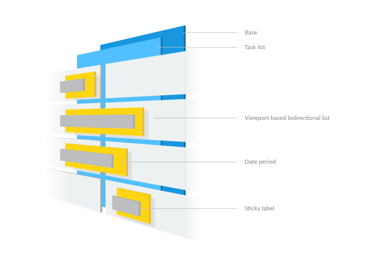
After a few weeks into the initial development, this is how the final component structure looks like:

- A core base for timeline pane (the week, weekend section, etc.)
- Task list (Tree-view hierarchical task list)
- Viewport-based bidirectional list for Timeline pane
- Date period on both single and cross-pane case
- Sticky label on date period
As shown above, each task has its own Timeline pane and all Timeline’s scrolling positions are synced with one and another.
Indexed-based Scroll View
We use a custom scroll view with center argument for creating indexed based scroll view, which is inspired by Google Flutter widgets. With this implementation, we are able to create a quick scroll-to-state feature. Every position and index can be shown within any scroll duration.
The basic idea is to scroll to a short distance, then reload the Timeline with a new center argument and place it out of the viewport, then again we scroll it to the position inside the viewport.
Timeline Pane
To deliver a smooth user experience for Timeline, we created a horizontal custom scroll view with the similar idea of the indexed based scroll view, called infinite bidirectional scroll view. With this implementation, the timeline scrolling can be made smoothly.
We leveraged Flutter’s powerful Viewport concept to get an infinite bidirectional scrollable view. Then, we converted the index from the backward list starting from -1 to all decrease numbers accordingly. We also set a flag to indicate which date the index 0 is, which is used to quickly scroll to a date position.
Widget forwardList = SliverList(
  delegate: SliverChildBuilderDelegate((BuildContext context, int index) {
    return cellBuilder(context, _getIndex(forward: true, index: index));
  })
);

Widget backwardList = SliverList(
  delegate: SliverChildBuilderDelegate((BuildContext context, int index) {
    return cellBuilder(context, _getIndex(forward: false, index: index));
  }),
);

Scrollable(
  viewportBuilder: (BuildContext context, ViewportOffset offset) {
    return Viewport(
      offset: offset,
      center: forwardListKey,
      slivers: [
        backwardList,
        forwardList,
      ]
    );
  },
)
Cross-pane Solution
Since the two infinite lists will be scrolled to the viewport, there is a case that the date period may be positioned across two lists. Therefore, we have to create two identical date periods on both lists, and make them overlap onto each other completely to prevent one of the anchors in the list from being destroyed when the list is moved out of viewport.

The Sticky Solution
With a limited viewing area on mobile screens, it is very difficult for our users to know where they are looking at from the project and get lost in content easily. This is why we believe it is important to provide users as much information as possible, and this is when the sticky label feature comes in handy.
At the beginning, we tried to simplify everything and followed the scroll view’s scroll notification, after getting the position then set it to a positioned label. Showing the sticky label at the beginning of each timeline pane depends on the calculation of the current position of the date period.
But we found that the new positioned label will only be updated till the next frame, which does not sync to the same timeframe as on scroll view, everything looks laggy.
Fortunately, the super rich Flutter community already has a few sticky solutions for this kind of case, so-call render layer sticky header. It is based on a layout timing solution, where we need to calculate every pixel in the render layer and not just to put every widget with size in it. Finally, we replaced the localToGlobal function with math operations based on scroll position and the pane shift for the cross pane case for better performance.
It’s Just the Beginning…
During this chaotic period, we would like to bring more meaningful things to the technology world. When we started to build the Timeline view, the first thing that came to our mind was how we can leverage Flutter's powerful solutions, and deliver it in a gorgeous, fast and stable UI without rebuilding a whole view component.
We map out each date unit into an index and integrate with the Silver mechanism from Flutter. Almost everything stays on the high level development concept in the widget layer and jumps into the render level only for the sticky view.
Feel free to install the Quire app and enjoy our Flutter-based mobile app. Let us know in the comment section or tweet us at @quire_io to let us know how you feel about our Timeline feature!


