productivity tips · Feb 21, 2020
Top 12 Quire Hacks that Make Your Productivity Great Again

It’s still the first quarter of 2020, and somehow if you are fighting the holiday or seasonal slump, we totally get it! Team productivity can slow down a bit with all of the cluttered task list, messy organization and awkward communication. In the spirit of sharing, in this post, we will let you know some of the top-notch Quire tips and hacks to make your life (and work) so much easier!
1. Turn on Advanced Mode for more details
Let’s face it, too much information is a serious problem. How can you focus on what needs to be done when you are presented with thousands of irrelevant information? When we first developed Quire years ago, our main concern was which information is considered important to users. A platform with the right amount of presented information will help users with their productivity, instead of diluting their focus.
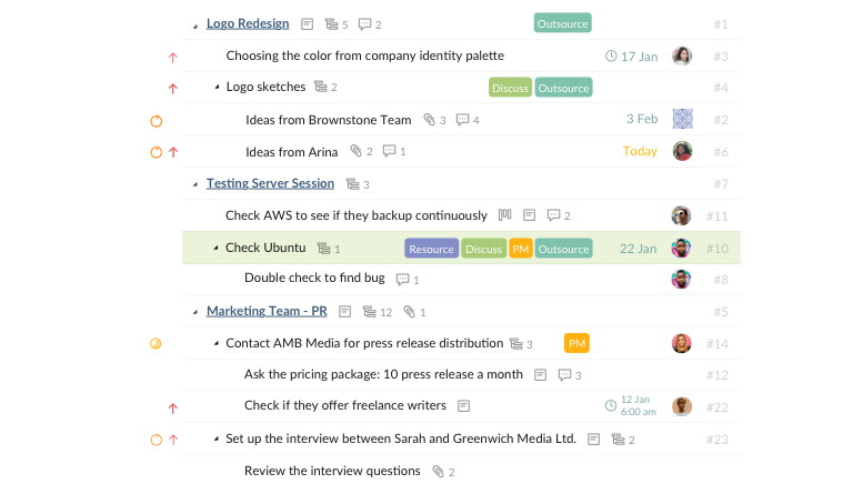
If you think your project doesn’t show enough information, chances are you have turned off the Advanced Mode. There’s a cool tip here: hit Ctrl on Windows or Alt on MacOS or simply shake your phone to enable the Advanced Mode.
Now look at the task list, isn’t it everything that you are looking for? We chose to hide some of the information that we personally think it’s not relevant, but in case we are wrong, here you go.
Wait! Are you too confused with this “brand-new” view now? Let us walk you through some of the hidden gems in the Advanced Mode.
First, you can view all tags in full name instead of being cut off. Then if you like to make unlimited subtasks, there is a small icon that indicates how many subtasks you have under a single parent task.
Moreover, Advanced Mode lets you know if a task contains a description, a comment or an attachment. The unique task ID will also show on the list so that it’s easier for you to track each task.
2. Expand progress bar to view the progress of each task
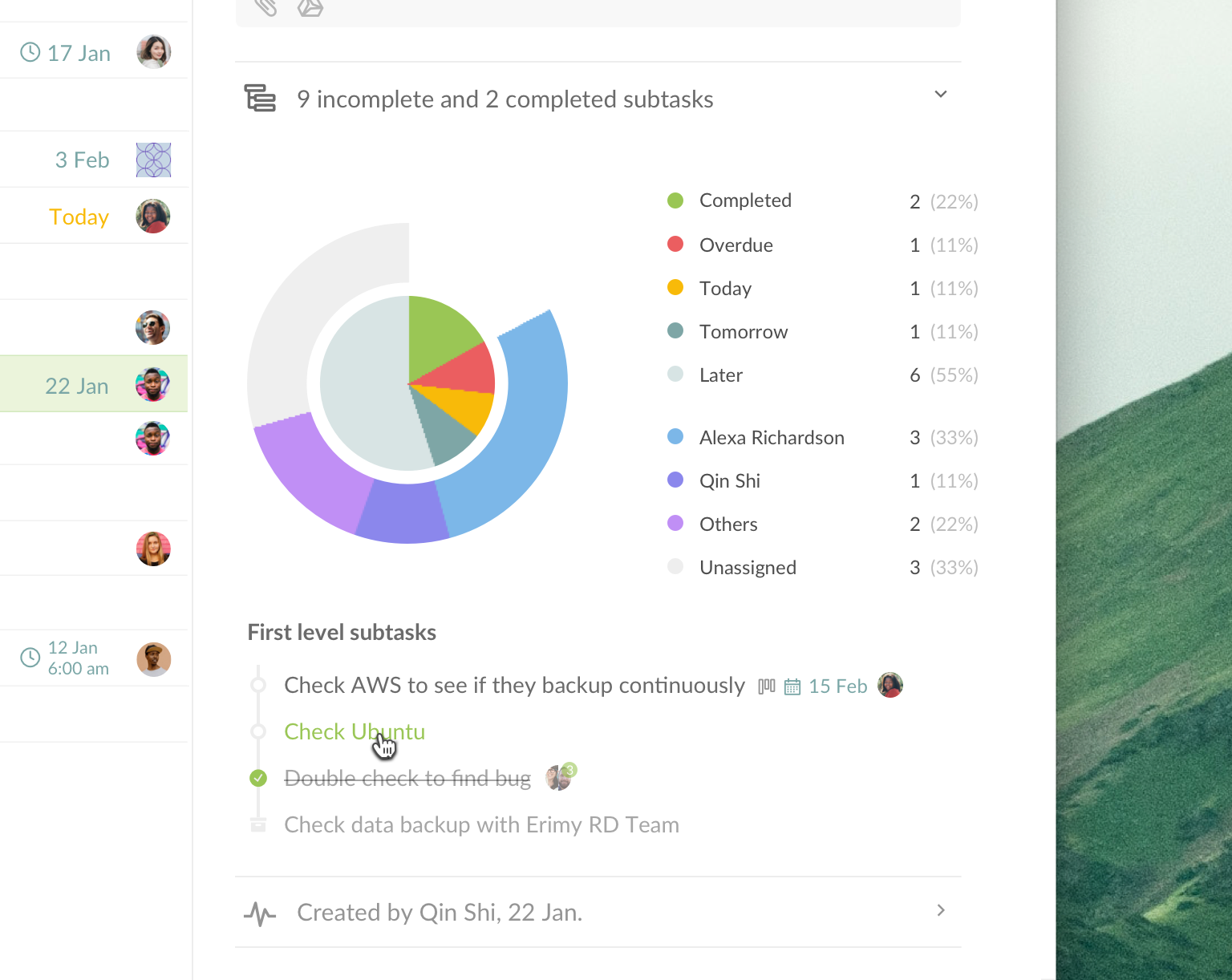
If you’re a Quirean for a long time, you already knew about the Overview page. It provides a comprehensive report of how your project goes. But did you know each task has its own overview section as well?
In the detail panel, under the Description section, you will see a line that says [#] incomplete and [#] completed subtasks. Click to expand and you can view a pie chart that summarizes the progress of the parent task and its subtasks. You can also view the clickable first-level subtasks as well. Cool, isn’t it?
3. Right-click to access Context Menu
There are so many exciting features that we want first-time users to know, but we don’t want you to be so overwhelmed with all of the information. That’s why we keep everything in a special menu called the Context Menu and you can right click to access it.
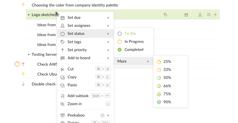
In the context menu, there are so many things you can do for your task. If you are not a keyboard shortcut person, this context menu will be your life-saver!
4. Add a cover for your task in Kanban Board
Wanna spice things up for your Kanban Board? You can always add a photo as an attachment to your task and use it as a cover. Now your board looks more like a beautiful canvas for you to get started on your tasks!

Maybe you already know this tip if you’re a Kanban Board lover, we just want to remind you again that you can always add multiple boards for one project to show different milestones!
5. Quickly navigate using Tab and Drag-and-Drop function
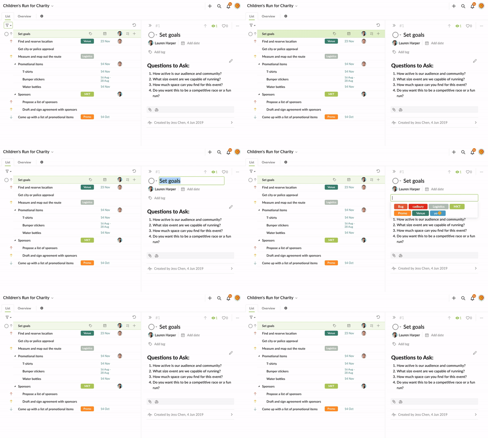
At Quire, we take the Tab very seriously. With a simple Tab button, you can navigate throughout the whole workspace. Just keep pressing Tab to jump to the next section in Quire. And how can you go back to the previous section? Hit the combo Shift + Tab and there you go, right where you should have stopped.
Sometimes when you don’t want to use the keyboard shortcut Ctrl + X and Ctrl + V, you can actually drag and drop your tasks to wherever you want them to be. Easy peasy!
6. Getting notified with the right notifications
Not every notification means the same - we got that! Too many notifications can drive a person crazy, that’s why we let our users configure which notifications that they want to receive for one project.
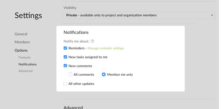
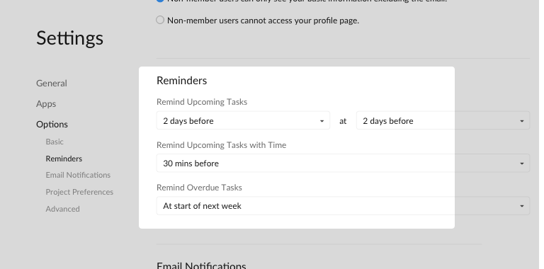
You can choose which notifications that you want to receive for your project in the project options. Also, if you want to manage your reminder settings, go to your Account Settings} and set the reminder however you want.
7. Sometimes one isn’t enough
As one of the most frequently asked questions for our support team, everyone seems to care a lot about how to do everything in a batch mode in Quire.
If you want to multiple administer several tasks, you can first use Ctrl + Arrow (or Cmd) to select the tasks you want to make changes to; then there is a menu that appears at the bottom of the page.
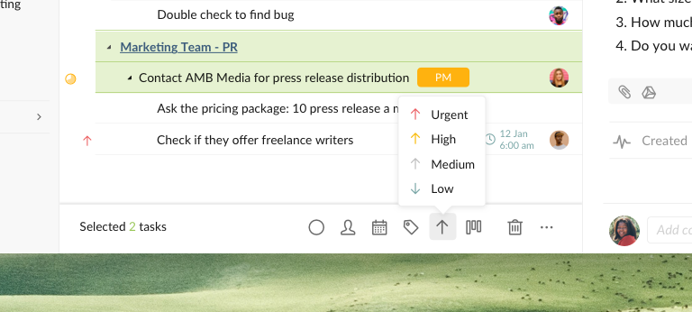
Now you can add assignees, due dates, tags, status, etc. to multiple tasks.
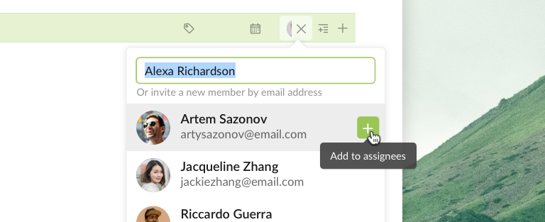
If you want to assign a task to multiple assignees, you can hover to the member email address and there’s a small + button on the right side. Keep clicking on the + button to add more assignees to your task.
8. Create unlimited Sublists for one project
Last month, we had a blast on our product launch on Producthunt! We introduced our ultimate sublist feature for the first time and so many people LOVE it!
We know with an ever-growing task list with no end in sight, you can get tired and unmotivated easily. Now with the Quire Sublist, you can create as many sublists as you want for your project! The sublist behaves as a magic mirror that mimics what you do to your tasks in the main task list.
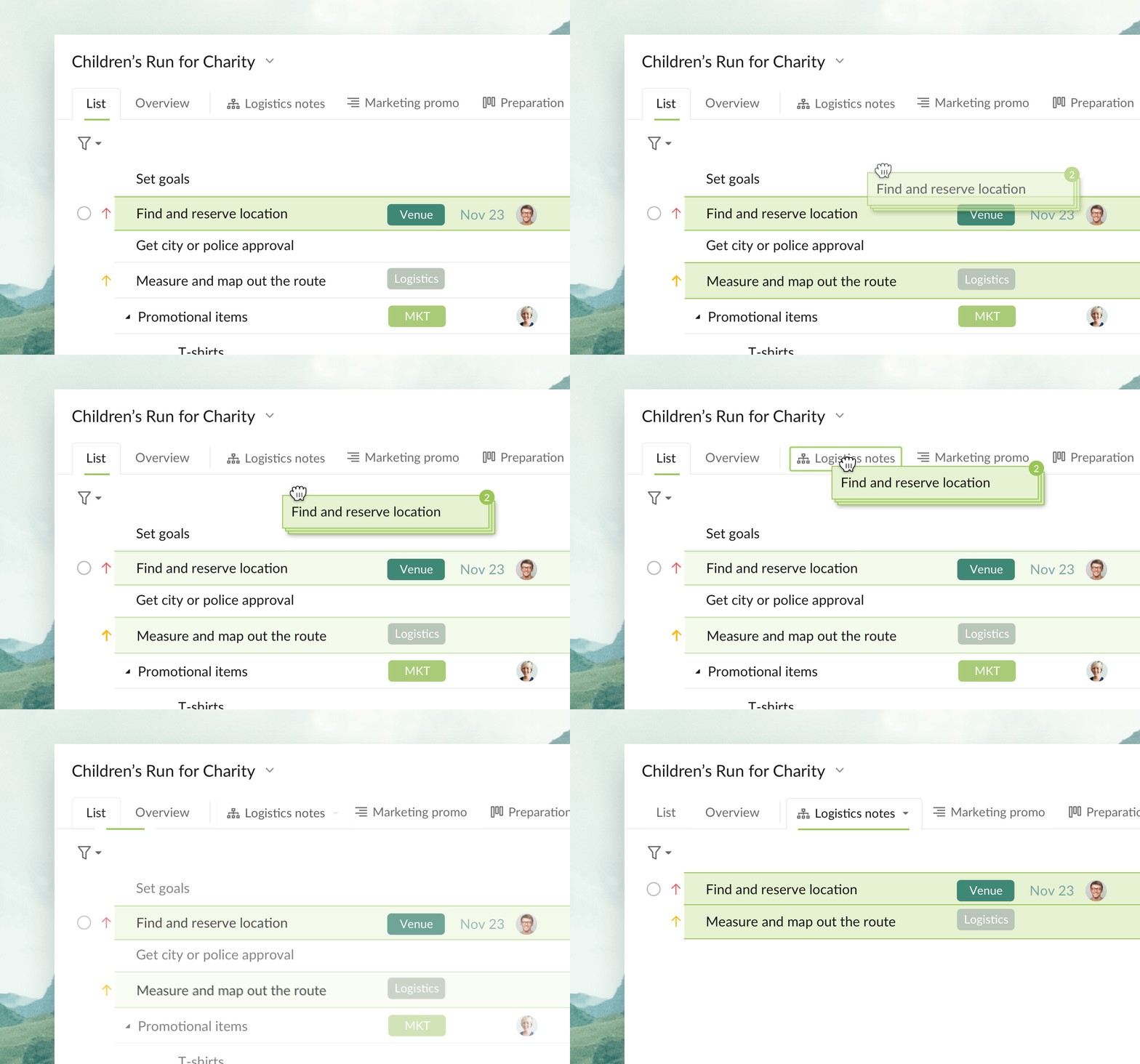
As easy as it sounds, you can add a sublist to your project and start dragging-and-dropping your tasks to the newly created sublist! When you want to remove the tasks from a sublist, just drag and drop them back from the sublist to the main list! Super intuitive, we know!
If you are curious about this feature, you can visit this blog post or this tutorial for Sublist.
9. Dynamic Filter and Sorting options
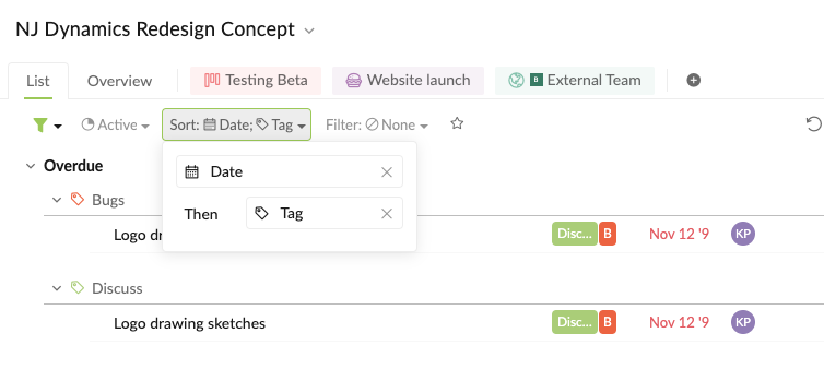
Sometimes you have to be creative with the sorting option in order to organize your task list better. With Quire dynamic sorting, you can hover through the sorting options, click on the + button then sort your task list by two levels.
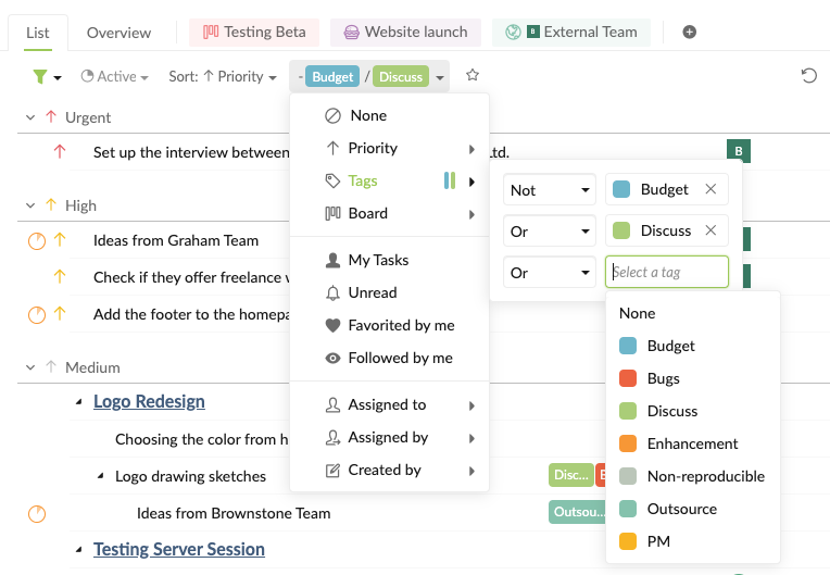
If you’re a tag lover, you will love to filter those tags using Boolean AND, OR, NOT! There’s nothing better than a neat view with all of the organized tasks!
10. Bookmark everything, even your filter
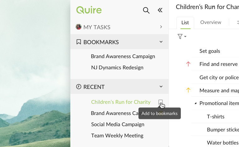
No one has time to go over hundreds of projects to find the one you need! Next time, just bookmark the projects that you usually have to view and they will show up in the Bookmark section!

Saved filter is a special feature that lets you set filter and sorting conditions for your task list then save them as a new filter for quick access. The best thing is, your saved filters will be synced across devices so when you created a saved filter with your browser, your mobile will automatically sync!
11. Get your task list styled with Markdown!

So many users have asked how to get their task list as beautiful as our screenshots; and the answer is: Markdown!
Basically, there are sets of rules that create rich text easily and quickly. Here is the list of our favorite markdown. If you are also a keyboard lover, we have some shortcuts that guarantee to make your life easier! Be honest here, who has time to use the mouse even if it’s Magic Mouse, right?!
12. Responsive graph to show detailed progress within a specific time period
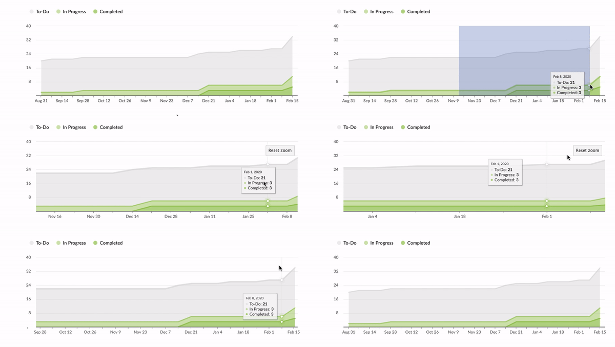
The project overview graph in Quire isn’t a boring graph! This chronological graph shows the progress of your task list, how many tasks are completed and how many tasks left that need to be taken care of.
But do you know if you use your mouse to select a specific time period, let’s say from Nov 23 to Jan 4, the graph will show more detailed progress. When you are presenting your project overview, this tip really comes in handy to show your work! You can always click on Reset zoom to reset your graph to the original state as well.
That’s all for today! If your team is struggling with all of the productivity problems, we hope these tips and tricks can help you achieve great things! What is the best Quire hack that you didn’t know until this post? What is the one that you use everyday? Share your thoughts and ideas with us in the comments below or tweet us at @quire_io!


